Statistics for Google Sheets
Editor's note: The Google Sheets add-on described in this blog post is no longer supported externally by Google.
By STEVEN L. SCOTT
Big data is new and exciting, but there are still lots of small data problems in the world. Many people who are just becoming aware that they need to work with data are finding that they lack the tools to do so. The statistics app for Google Sheets hopes to change that.
Editor's note: We've mostly portrayed data science as statistical methods and analysis approaches based on big data. But some of our readers have perfectly validly pointed out that this may be too narrow a view. While big data remains a focus of this blog, there are exciting innovations happening in other areas as well. Steve's post is an excellent example of this, and we are thrilled to see him contribute this month's article.
Introduction
Statistics for Google Sheets is an add-on for Google Sheets that brings elementary statistical analysis tools to spreadsheet users. The app focuses on material commonly taught in introductory statistics and regression courses, with the intent that students who have taken these courses should be able to carry out the analyses that they learned when they move on to jobs in the work force.
Frequent readers of this blog probably don’t think of themselves as spreadsheet users, and may be wondering why anyone would want to carry out data analysis in a spreadsheet environment. After all, working with data in spreadsheets involves serious limitations, with scale being an obvious one. Google sheets is currently limited to 2 million cells, which is too small to hold a modern medium-to-large size data set. A spreadsheet-based app can’t (and shouldn’t!) hope to replace R, SAS, or similar packages designed by and for statistics experts.
Yet while the rise of “big data” problems has not reduced the number of “small data” problems in the world, the rise of “data science” has put data on the radar of many non-specialists. These are users who may have had (or may be taking) an introductory statistics course in college, but who have chosen to pursue skills other than data science. Spreadsheets are a natural choice for this audience both because spreadsheets are ubiquitous and because they provide an intuitive way to visually inspect the raw data.
The goal of the Statistics app is to “democratize data science” by putting elementary statistics capabilities in the hands of anyone with a Google account. Because the app is merely an add-on to Google sheets, its learning curve is considerably gentler than that of an entirely separate software package. Because it runs in the browser it imposes no additional installation or maintenance requirements, which can be helpful for IT administrators as well as analysts and students. It is easy to underestimate the amount of work involved for an IT department to support individual software packages, which can make it hard for a young analyst in a medium to large sized corporation to gain access to statistical software, even a free system like R. Because most employees do not have administrator privileges on their computers, many of the ideas taught in elementary statistics courses go unimplemented in the workplace for lack of software.
Example: Stock Market Returns
To see the app in action, open this data set showing S&P500 stock market returns in Google Sheets. This document is shared with the Internet, so make a personal copy that you can edit by selecting File → Make a copy from the menu. If you don’t already have the Statistics app installed, select Add-ons → Get add-ons and search for the app named Statistics.
Of course, we’re not providing investment advice, and each person would need to evaluate the results for themselves. What we’re going to do is work through how the app might be used.
Of course, we’re not providing investment advice, and each person would need to evaluate the results for themselves. What we’re going to do is work through how the app might be used.
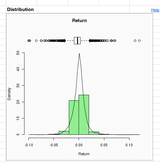
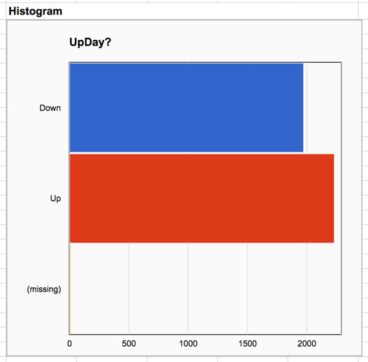
One of the variables in the data (column H) is named Return. It shows the percentage change relative to the previous day’s closing value. A related variable (in column J) is UpDay?, which indicates whether Return > 0. We can explore the values in these two columns by selecting Add-ons → Statistics → Describe data and entering these two variables in the Variables section of the right hand configuration pane (using Ctrl+Click or Cmd+Click to select several values). Notice that UpDay? is automatically treated as a factor because its values (the words “Up” and “Down”) are non-numeric.
Clicking the Create button at the bottom of the right hand pane creates a new sheet named "Univariate 1" filled with numerical and graphical summaries describing the data. Notice that the summaries are different for numeric and factor data. The histogram of Return appears nearly symmetric, but the histogram of UpDay? shows that there have been slightly more up days than down. We also see a third category named “missing”. Both Return and UpDay? were constructed from raw data in columns A-G using spreadsheet formulas, which are exposed in the spreadsheet’s formula bar when you click on the data in these columns. In particular, Return is the percent change from the previous day, so the formula for the very first day (the last row in the data set) returns an error, because there is no previous day to compare against. The app considers the cell containing the error to be missing data.
The summaries of Return simply omit the missing observation (although the presence of missing data is reported on the “N missing” line, below the plots), but the factor variable UpDay? counts the missing value as a separate category. We can manually exclude the missing values from the analysis by adding the variable Use? (found in column L) as a filter. A filter is a variable filled with TRUE and FALSE values. Setting a filter instructs the app to use the rows where the filter is TRUE, and to omit the rows where it is FALSE. We have set the last two entries in Use? to FALSE because we will soon care about the variables LagReturn and LagUpDay? which give the values of Return and UpDay? on the preceding day. Each of these introduces an additional missing observation, which we also wish to exclude.
Repeating the analysis after setting the filter (and clicking Create again) produces a summary of Return that is essentially unchanged, but the missing category is no longer present in the histogram for UpDay?.
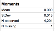
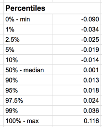
Beneath the graphs are numerical summaries. The mean daily return is zero to 3 decimal places, but clicking on the cell containing this number shows the mean to full precision. The standard deviation of daily returns is 1.3%. There have been 2230 up days and 1970 down days. Other charts include a normal quantile plot for judging whether returns are normally distributed (they have fatter tails than normal), and Pareto and pie charts for judging the relative proportion of up days.
Things get more interesting when we look for factors that potentially explain stock market returns. If we click the “By” button in the right hand pane we can see how the distribution of returns (and up/down days) varies with the return value the previous day (LagReturn), or whether the previous day was up (LagUpDay?). Let's choose the latter first.
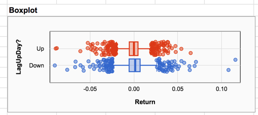
The boxplot below compares the distributions of returns on days following up and down days. The plot shows that the two days with the highest returns (which are substantially higher than other returns) occurred on days following down days.
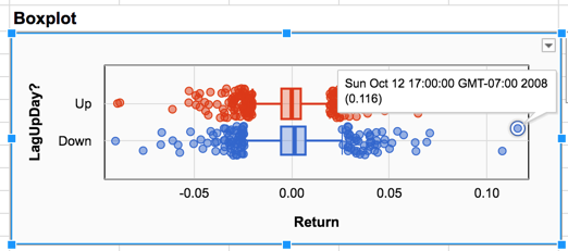
Setting the Date variable as a label (using the Labels button in the right hand pane) allows us to click on the individual dots and find that both extreme points took place in October of 2008, during the financial crisis when the markets were extra volatile and prone to wild swings. On these two days the S&P 500 increased by more than 10% in a single day. The extreme losses on the left side of the plot also took place in October 2008, which was a bad month for the markets overall. If we wanted to, we could set some of these extreme observations aside in future analyses by setting their values to FALSE in the filter variable.
If you look closely at the boxplots you can see that returns following down days have slightly greater variation than returns following up days. The boundaries of the box are wider, and the stems extending from the box are slightly longer. The means and standard deviations of the two groups bear out the impression we obtained from the plots.
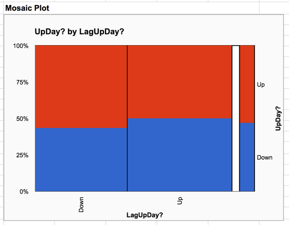
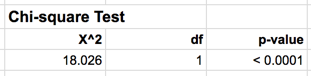
The mosaic plot for the relationship between consecutive up and down days shows a slight effect - following a down day, the probability of a down day is slightly lower than when following an up day. To see if this effect is statistically significant we can look at the chi-square test below the plot. The chi-square value of 18.026 is too large to be observed by chance with 1 degree of freedom, so it is probably safe to conclude that the distribution following up days really is different than the distribution following down days.
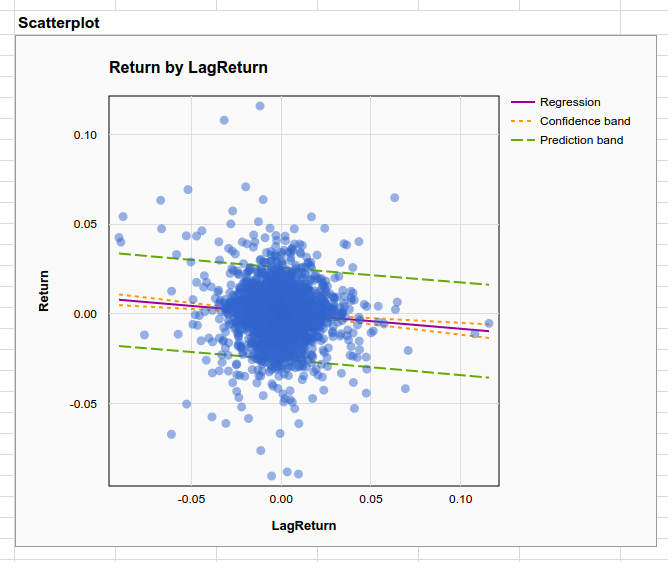
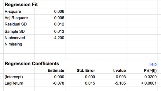
Now change the variable in the “By” section of the configuration pane from LagUpDay? to LagReturn. Doing so allows us to look at how predictable daily returns are as a function of the previous day’s return. The scatterplot describing this relationship shows very little pattern, but there is a clearly negative slope to the trend line. Looking below this plot we see there is a small $R^2$ of .006, but the p-value for the slope of the regression line is highly significant with p < .0001. This is very strong evidence of a very small (but nonzero) effect. In other words, there is a real trend towards self correction in the market but it is not very strong.
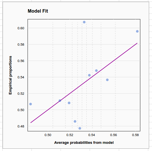
Finally, you can use logistic regression to see how a previous day’s return affects the probability of the next day’s return being positive. Here again we see a deviance $R^2$ of only 0.002, but the p-value for the logistic regression coefficient is .0013, which fits with our previous conclusion about strong evidence of a small effect.
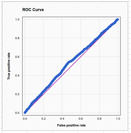
The weakness is evident when we look at the model fit plot, which plots the proportion of up days vs the average estimated probability of an up day in 10 equal-sample-size buckets, and the ROC curve, which is very nearly a straight line.
Where to go from here?
Statistics for Google Sheets gives analysts and students the tools to conduct elementary statistical analyses in a familiar spreadsheet environment. Keep in mind that everything shown above was based on one menu selection: Add-ons → Statistics → Describe Data. More sophisticated tools for linear and logistic regression are available on the other (Regression) menu selection. Taken together with native spreadsheet functions for elementary data management, probability, and hypothesis testing the app currently provides all the tools needed for a 1-2 semester introductory statistics course, in a format that students can take with them when they become analysts.
We hope to add more capabilities to the app in the future. We’d like to scale the tool to handle bigger data (possibly handling data sources from outside the spreadsheet), improve coverage in the help system (to better educate the public), build in more elaborate modeling capabilities (methods for handling time series are an obvious choice), and provide more advanced statistical methods (e.g. Bayes and machine learning tools). With increased familiarity these tools can become more broadly understood and more broadly used.
great! I like the help-links and the explanations there!
ReplyDeletefinally, I won't have to bother when students use different (OS-dependent) versions of data analysis add-ins when teaching (business/basic) statistics to MBA students ...
This is a great tool! I just finished Intro to Econometrics and it's great to have a simple, easy tool to do linear regressions, etc. I seriously wish we'd used this tool in the intro class so we could have concentrated more on concepts rather than techniques, tips, and traps; saving R and Stata for the intermediate course.
ReplyDeleteHi Steven, I would like to know is there any way we can plot conventional variability chart, the same way we get in SAS JMP software.
ReplyDeleteThis is great. I'm pretty familiar with R at this point, but I personally prefer Google Sheets for when I do basic analysis. It's much easier to share with colleagues, and I can combine it easily with the QUERY function, which allows me to subset data. Of course, you can do this in R with dlpyr or rockstar base R, but for someone who is not a computer scientist, the data that I come across is much more apt to integrate with Google sheets easily.
ReplyDeleteI also enjoy the interface that Google Sheets provides, and with a little javascript, it can do many things that R can. For someone that does not have time and know-how to create custom tools that can interact with the data I come across - Google Sheets is preferable, and in time it will become even more robust! Hats off to you in your endeavor here, I will be checking it out!
How to Install it?
ReplyDeleteHi, now it is impossible to install it. This message appears: "This app has not yet been verified by Google in order to use Google Sign in". What I can do?
ReplyDeleteStatistics for Google Sheets is no longer available on Google Sheets. Are there any plans for submitting the add on for review and approval?
ReplyDelete